
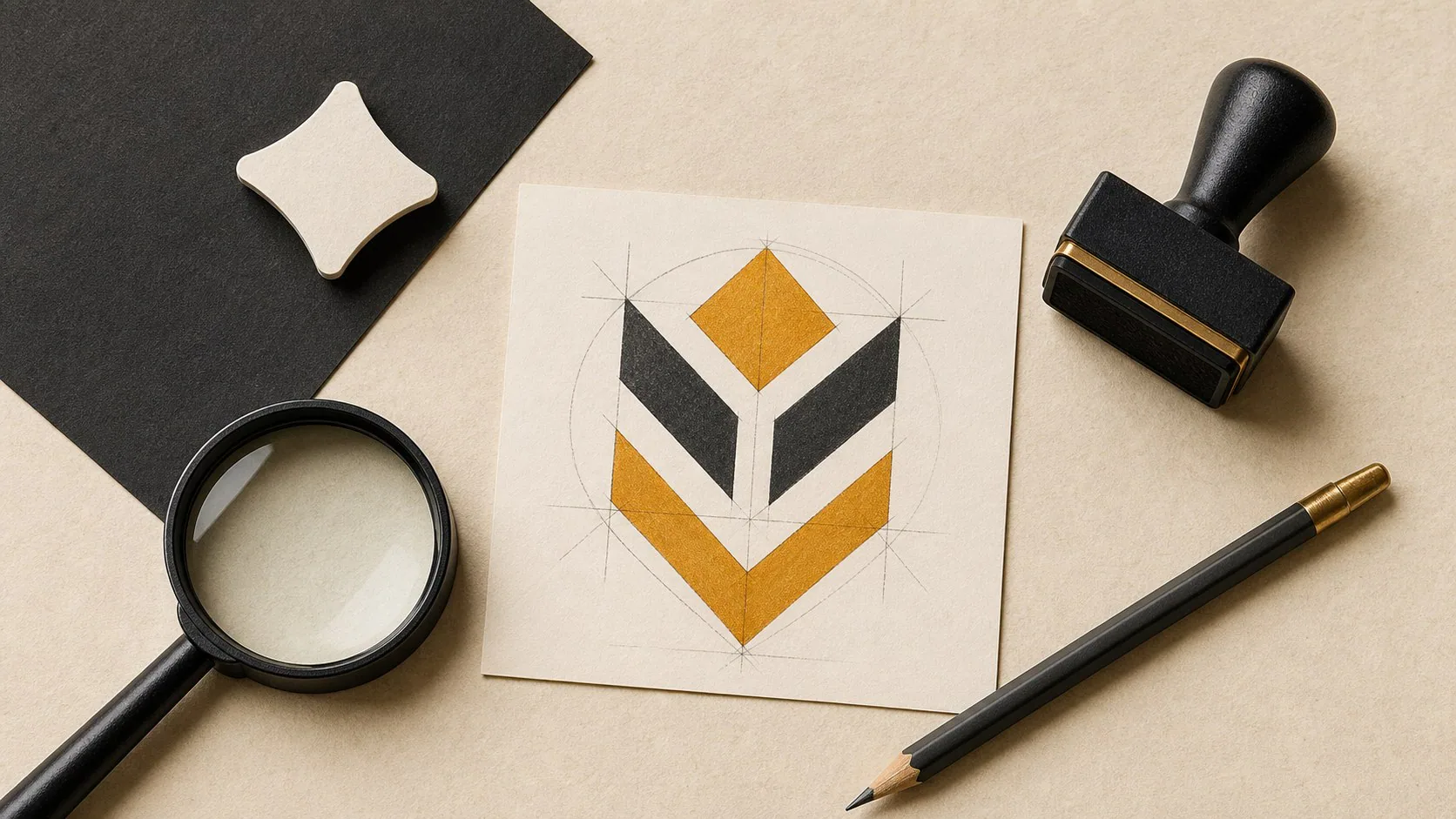
A complete brand identity should give a business more than one logo file. It should define the core mark, responsive logo versions, colour system, typography, image direction, usage rules and practical templates needed across web, proposals, email, social media and print. AI can speed up exploration, but the final identity still needs human judgement, distinctiveness checks and a usable handover system.
A logo can be finished while the brand is still unfinished.
That is the gap a business should look for when comparing brand identity designers in Pretoria. The mark matters, but the real test is whether the identity can survive a website header, proposal, invoice, social post, vehicle, presentation and email signature without being redesigned every time.
This guide restores an older IDJoy article that previously ranked through the site’s query-string blog system. The 2026 version focuses on the parts of identity work a business can actually inspect before approving a designer.
Start with the job the identity must do
Before discussing style, define where the business needs to be recognised and trusted.
A useful discovery process should answer questions such as:
- What does the business sell?
- Who needs to trust it?
- Where will the identity appear most often?
- Which competitors or category conventions will buyers already recognise?
- Does the business need to look established, technical, premium, accessible, energetic or something else?
- What existing visual assets must be kept?
- Which applications are urgent: website, tenders, packaging, signage, uniforms, proposals or social media?
Without that context, a designer can make an attractive symbol that solves the wrong problem.
What a complete identity usually needs
The exact scope depends on the business, but a practical identity system normally covers more than a single master logo.
1. A primary mark
This is the main version used when space allows. It should remain recognisable at the sizes and backgrounds the business actually uses.
2. Responsive logo versions
A wide logo may fail inside a social avatar, favicon or narrow mobile header. The system may need a compact lock-up, icon or monogram that is still clearly connected to the primary mark.
3. Colour rules
A palette should explain which colours lead, which support, and how contrast works on light and dark backgrounds. A list of hex codes without usage guidance leaves the next designer guessing.
4. Typography
Type choices affect how the identity behaves in long documents and on the web. The handover should identify practical headline and body styles rather than naming a font with no hierarchy.
5. Image direction
Photography, illustration, iconography and graphic treatments can make two companies with similar logos feel completely different. The identity should give future content a visual direction.
6. Usage rules
Clear space, minimum size, background treatment and incorrect-use examples protect the mark from being stretched, recoloured or crowded by other elements.
7. Real applications
Mock-ups are useful when they test the system rather than decorate a presentation. A proposal cover, website hero, social post or workwear application can expose weaknesses before the identity is handed over.
The files you should expect at handover
Ask what you will actually receive before signing the project scope.
A business may need:
- Vector master files for future professional production.
- SVG versions for modern web use.
- PNG files with transparent backgrounds.
- JPEG or other raster versions where needed.
- Colour and monochrome variations.
- Horizontal, stacked and compact marks where the identity requires them.
- A brand guideline or usage document.
- The practical templates included in the agreed scope.
The key question is ownership and usability: can another competent designer or developer continue the system without rebuilding it from screenshots?
A logo presentation should explain decisions
A strong presentation does not rely on “this feels premium” as the entire rationale.
The designer should be able to explain:
- What customer or business problem the direction answers.
- Why the form is recognisable.
- How it behaves at small sizes.
- Why the typography fits the business.
- How the colour system supports readability and distinction.
- Where the mark is likely to struggle.
- What was deliberately avoided and why.
That makes feedback more useful. The conversation moves from personal taste to whether the system does its job.
Where AI fits into brand identity design
AI can be useful during research, mood exploration, naming exercises, visual references and rapid concept generation.
It can also create a false sense of completion.
An AI-generated logo image may still need:
- Redrawing as clean vector artwork.
- Optical correction.
- Typography refinement.
- Small-size testing.
- Colour and accessibility checks.
- Originality and trade mark searches.
- Human judgement about whether the result genuinely fits the business.
That is why “AI made the logo” and “the business has a usable identity system” are different statements.
For the legal and ownership questions around AI-assisted marks, read Can You Trademark an AI-Generated Logo in South Africa?.
Five questions to ask a Pretoria brand identity designer
What happens before concepts are drawn?
You are looking for a process that gathers business context, not only a request for favourite colours.
What is included beyond the logo?
Ask for a written list of deliverables. “Brand identity” can mean very different things between providers.
How will the identity be tested?
The applications most important to your business should influence the work before approval.
What files and usage rights will I receive?
Clarify the handover, editable source files where applicable, third-party font or asset licences, and any restrictions before the final invoice.
How are revisions handled?
A clear review process protects both sides. It should distinguish refinement of an approved direction from starting a completely new brief.
Red flags that create expensive problems later
Be cautious when the process depends on any of these:
- One logo file with no alternate version.
- No vector master.
- Colours chosen without contrast testing.
- A visual direction copied too closely from a competitor.
- Mock-ups that look good but hide how the mark works on real backgrounds.
- Unclear font licensing.
- No explanation of who owns the final artwork.
- AI output presented as final production artwork with no refinement or checks.
- A brand guide that describes personality but gives no practical usage rules.
The cost of fixing these issues often appears after launch, when a printer, developer or sign maker asks for files the business never received.
Brand identity and the website should be designed to meet each other
The website is usually the place where the identity has to work hardest.
A brand may need:
- A logo that works in a shallow navigation bar.
- Accessible colour combinations for buttons and text.
- A type system that remains readable on small screens.
- Photography rules that can scale across service pages and articles.
- Motion that supports the identity without making the interface harder to use.
If the brand and website are commissioned separately, the handover between designer and developer matters. Give the developer the actual identity system, not a PDF screenshot of the logo.
A simple approval scorecard
Before approving the final direction, score each statement from 0 to 2.
| Question | 0 | 1 | 2 |
|---|---|---|---|
| The identity is clearly connected to the business strategy | No | Partly | Yes |
| The logo works at small and large sizes | No | Partly | Yes |
| Light and dark background versions are defined | No | Partly | Yes |
| Typography hierarchy is usable beyond the presentation | No | Partly | Yes |
| Colour contrast has been considered | No | Partly | Yes |
| The identity works in the business’s main real-world applications | No | Partly | Yes |
| Handover files and usage rights are clear | No | Partly | Yes |
| Another designer or developer could continue the system | No | Partly | Yes |
A low score does not mean the logo is ugly. It means the identity is still too dependent on the person who created the presentation.
What you are buying
The useful outcome of brand identity design is not a folder full of logo variations.
It is a set of visual decisions that the business can repeat consistently.
That consistency reduces design guesswork, makes future marketing faster to produce and gives customers a more coherent experience from the first search result to the proposal they receive after an enquiry.