
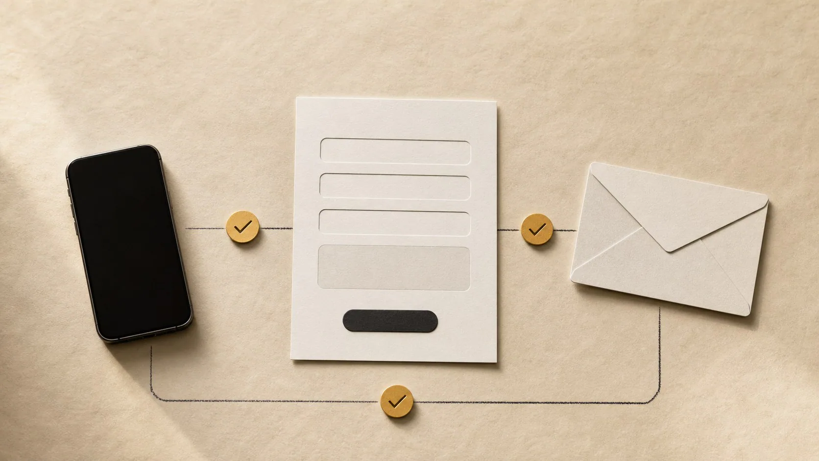
Mobile-first design starts with the customer’s smallest, most constrained screen. Keep the service and CTA clear, use readable type and spacing, make phone and WhatsApp actions easy to tap, reduce form friction, prevent sticky elements from covering content and test on mobile data. Measure successful enquiries and qualified leads, not only mobile traffic or button taps.
Responsive design can mean “the desktop page fits on a phone”.
Mobile-first design asks a better question: Can a person complete the important decision comfortably on a phone?
For many South African service businesses, that decision is to call, start WhatsApp, request a quote or submit a short form.
Design the first screen at phone width
Start with the content a mobile visitor needs first:
- service;
- customer problem;
- location or availability where relevant;
- primary action.
Avoid opening with a full-screen animation that delays the explanation.
A mobile hero does not need every desktop decorative element. Keep what helps the user understand or act.
Make the primary CTA thumb-friendly
A button should be easy to tap without zooming or carefully aiming.
Check:
- size;
- spacing from other controls;
- contrast;
- label clarity;
- whether a sticky bar covers another action;
- whether the CTA still makes sense after scrolling.
“WhatsApp us about website redesign” is clearer than a small unlabeled chat icon.
If the action is a phone call, show enough context that the user knows which business or branch they are calling.
Do not let sticky UI consume the screen
Mobile height is limited.
A cookie banner, navigation bar, WhatsApp bubble and sticky CTA can stack until the visitor sees more interface than content.
Test the combined result.
Use fixed elements only when they earn the space. Make them dismissible where appropriate and respect safe areas on modern phones.
A sticky CTA that covers the form submit button reduces usability instead of improving conversion.
Keep paragraphs readable
Desktop text often becomes dense on a narrow screen.
Use:
- comfortable font size;
- clear line height;
- short paragraph blocks;
- meaningful headings;
- lists when the content is genuinely a set of items;
- enough space between sections.
Do not reduce the font to fit more words above the fold.
A visitor can scroll. They should not have to squint.
Preserve information parity
Mobile-first does not mean hiding useful content from mobile visitors.
Google’s mobile-first indexing guidance emphasises keeping important content available across mobile and desktop versions.
If the desktop service page has pricing, case studies and important service details, do not remove them from mobile simply to make the page shorter.
Reorder and simplify the presentation instead.
Make forms fit the phone task
For a first enquiry, ask only what your team needs to respond.
Improve mobile forms with:
- correct input types for email and telephone;
- autocomplete where appropriate;
- labels that stay visible;
- useful error messages near the field;
- large controls;
- preserved values after an error;
- visible sending state;
- success message after the server confirms submission.
Avoid two-column form layouts on narrow screens.
Do not ask the user to type information the website already knows, such as the service page they came from.
Use WhatsApp as a deliberate mobile path
A mobile visitor may prefer WhatsApp because the app is already installed and the conversation can continue later.
Carry context into the chat with an editable prefilled message.
Example:
Hi, I’m enquiring about your website redesign service.
Do not prefill a long promotional paragraph.
State the response expectation if the inbox is not monitored continuously.
Make phone links real links
Use tel: links for numbers intended to be called.
Test them on a physical phone.
Check that:
- the visible number is correct;
- the link dials the same number;
- branch pages use the correct branch;
- tracking does not break the destination;
- the number is not inside an image.
A beautiful contact card that cannot be tapped is a desktop design carried into the wrong context.
Keep navigation short without hiding structure
Mobile navigation should help a visitor reach the important pages without opening several nested menus.
Prioritise:
- Services;
- Pricing where published;
- Work or case studies;
- About when trust matters;
- Contact or project enquiry.
If the site has many pages, group them logically rather than putting every URL in the first menu layer.
The menu should be keyboard accessible and close predictably.
Test performance on mobile data
A page that feels fast on office fibre can stall on a weaker mobile connection.
Check:
- image size;
- video loading;
- font files;
- third-party scripts;
- animation libraries;
- chat widgets;
- render-blocking resources.
Do not load a 20 MB hero video automatically because the desktop mock-up looked impressive.
Use responsive image sizes and lazy-load below-the-fold media where appropriate.
Keep motion useful and respect reduced motion
Animations can explain sequence or add feedback.
They can also delay content and create discomfort.
Use motion for a reason:
- menu state;
- form feedback;
- progressive disclosure;
- section transition;
- product demonstration.
Respect prefers-reduced-motion and avoid scroll effects that make important text difficult to read.
Conversion design should not require a user to tolerate an effect to access the service information.
Test common mobile failure states
Do more than resize a desktop browser.
Test:
- Android phone.
- iPhone where available.
- Mobile data.
- Portrait orientation.
- Large text or browser zoom.
- Slow form submission.
- Invalid form entry.
- WhatsApp installed and not installed where possible.
- Phone call link.
- Keyboard covering the active field or button.
Record the exact failure and device instead of writing “mobile broken”.
Measure the whole enquiry path
Track mobile outcomes separately where useful:
- service page visits;
- CTA clicks;
- form starts;
- form completions;
- WhatsApp clicks;
- phone clicks;
- qualified enquiries;
- sales.
A high WhatsApp click rate can still hide a weak outcome if most conversations never become relevant enquiries.
Compare click data with what the team receives.
Mobile-first is a priority order
It does not mean desktop becomes an afterthought.
Design the constrained phone journey first, then use larger screens to add space, comparison and richer visuals without changing the meaning of the offer.
The result should feel intentional at both sizes.
IDJoy tests website projects around real enquiry actions on mobile as part of its website design and redesign work.